Designing responsive layouts can be challenging—especially when elements need to align, center, or adapt across devices. That’s where CSS Flexbox comes in. Short for Flexible Box Layout, Flexbox is a modern layout model that simplifies alignment and spacing in CSS, especially when working with dynamic or responsive web designs.
What is Flexbox?
Flexbox is a one-dimensional layout model in CSS used to align items horizontally or vertically with space distribution, alignment, and order control—all done within a container.
The two main components:
-
Flex container (the parent element)
-
Flex items (the child elements inside the container)
How to Use Flexbox in CSS
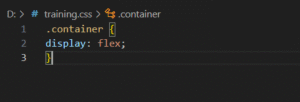
Step 1: Define a Flex Container
To begin, set the container’s display property to flex:
Step 2: Add Child Items
Flexbox will automatically apply its layout rules to the immediate children of the .container.
Key Flexbox Properties
For Flex Container:
| Property | Description |
|---|---|
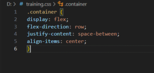
flex-direction |
Row (default), column, row-reverse, column-reverse |
justify-content |
Align items horizontally (flex-start, center, space-between, etc.) |
align-items |
Align items vertically (stretch, center, flex-start, etc.) |
align-content |
Space between rows (used when wrapping) |
flex-wrap |
Allows items to wrap into multiple lines |
Example:
For Flex Items:
| Property | Description |
|---|---|
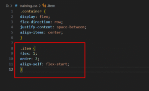
flex |
Shorthand for flex-grow, flex-shrink, and flex-basis |
order |
Reorders items without changing the HTML |
align-self |
Overrides align-items for a single item |
Example:
Common Layouts Using Flexbox
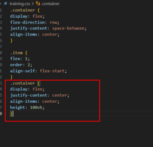
1. Centering Elements
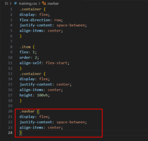
2. Responsive Navigation Bar
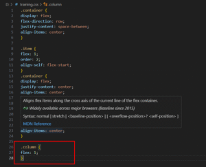
3. Equal Width Columns
Benefits of Flexbox
-
Eliminates float and clearfix hacks
-
Aligns elements easily (vertical and horizontal)
-
Makes responsive designs easier
-
Provides more control over spacing and element order
-
Works well for small-scale layouts and UI components
When Not to Use Flexbox
Flexbox is ideal for one-dimensional layouts. For more complex two-dimensional grid-based layouts, consider using CSS Grid.
Flexbox is a powerful and intuitive CSS module that gives developers full control over alignment, distribution, and spacing of elements in a container. Once you master Flexbox, building responsive designs becomes significantly easier.
Start experimenting with Flexbox and see how much cleaner and more efficient your layouts can become!